One part of Magento that performs particularly poorly on Mobiles is the use of tables mainly because there just isn’t enough room to see everything in a legible manner.
Some clever people have invented ways to overcome this through scrolling tables http://zurb.com/playground/responsive-tables or http://elvery.net/demo/responsive-tables/ but for ecommerce I don’t think it works well as the information often important information is hidden without scrolling the table.
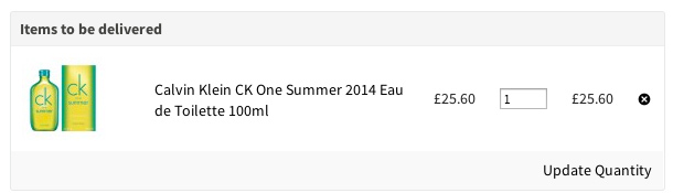
For example on the cart table you typically would get something like this
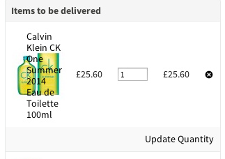
Which on mobile looks like this
I find it’s easier to have a hidden alternative layout for mobile

[code]
@media screen and (max-width: 800px) {
#shopping-cart-table {
display:none;
}
#shopping-cart-mobile {
display:block;
}
}
[/code]
This is only shown at the breakpoint you define in my example 800px at the same time hiding the normal table output.
This method does create extra markup though and a more organised approach might be to have a separate theme but this would rely on sniffing out the user agent and has the expense of keeping another theme up to date with any changes.
Perhaps the best solution is to ditch the table markup all together for DL’s, I would like to hear your thoughts.
Looks a really good solution, am looking to implement something similar. Do you have a code example of your cart.phtml to match this?
Something like this where small-16 is your full width grid, I use Foundation.
<div class="small-16"> <?php function getDeleteUrl($item) { $params = array( 'id'=>$item->getId(), Mage_Core_Controller_Front_Action::PARAM_NAME_URL_ENCODED => Mage::helper('core')->urlEncode(Mage::getUrl('checkout/cart')) ); return Mage::getUrl('checkout/cart/delete', $params); } $cartItems = Mage::getSingleton('checkout/session')->getQuote()->getAllItems(); foreach ($cartItems as $item){ ?> <div class="mobile-product"> <a href="<?php echo getDeleteUrl($item)? rel="nofollow">" title="Remove item" class="btn-remove btn-remove2">Remove item</a> <img src="<?php echo $item->getProduct()->getThumbnailUrl(); ?>" width="50" height="50" /> <h6><?php echo $item->getName(); ?></h6> <p class="price"><?php echo $item->getQty(); ?> x <?php echo $this->helper('checkout')->formatPrice($item->getPrice()); ?></p> <div class="clearfix"></div> </div> <? } ?> </div>Works great once typo is fixed.
<a href="” title=”Remove item” class=”btn-remove btn-remove2″>Remove item
<a href="” rel=”nofollow” title=”Remove item” class=”btn-remove btn-remove2″>Remove item
Thanks for this.